Thursday, June 23, 2011

Artistic Inspiration


I found this artist that makes art on dirty car windows. I found this really inspiring because normally if your car was dirty you would wash it, but this person thought of the dirt differently and decided to do drawings in it. By wiping more dirt of in the darker parts and leaving more dirt on in the lighter parts. To get the tones in between the dark and the light shades, he wiped out tiny bits of the dirt, to give it a darker gray color. There are a tone of different pieces he has done, you can see some of them down below, or you came see them all on his website Here. To make these pieces of art he first used his finger but then started to use his paint brushes. Not only has he done this art on cars but he has done it on glasses, and done big dirt murals on store windows.


he has also played a role in a music video 

Wednesday, April 20, 2011

Realistic Drawing


The last couple of weeks we worked on realistic drawings of still life. We spent the first week of our realistic drawing we practice by drawing; bear, coyote, and dear skulls that we have in the class.   Something that I found really tricky about this project was getting the shading to be clean, so that you couldn’t see all the lines. Fix that I had to keep going over all the shaded parts really lightly with my pencil till those lines disappeared. Also when I was drawing it was really hard to keep the side of my hand from smudging the graphite, so to solve that problem I put a piece of paper under my hand so that I could rest my hand down on the page and keep it from smudging. I was really impressed with it in the end. It was by far the best realistic drawing I have ever done. I think that it was a very good composition; the lights and darks are not totally even so that it doesn’t look to even. Over all I was very impressed with my work on this project, if I could do it again I would have a piece of paper under my hand to keep the whole project smudge free.

Wednesday, April 13, 2011

Technical and Artistic Reflection


Kinetic Typography
Jesse Sanderson

For the kinetic typography project, I did a scene someone made out of different clips from Napoleon Dynamite the 2004 movie directed by Jared Hess, about a bunch off losers in high school, trying to be accepted as them selves.  I made it in Adobe Flash CS4, using adobe after affects would have been a better program to use, but flash is what we were assigned to use. I used a font I found online that was used a lot in the movie, called 3Dumb. Napoleon uses a font like this in all the drawings he did in the movie, so I thought it would be a good font to use. Also the background I used was the same wallpaper used on the walls of Napoleon Dynamite’s house.

 When I created my storyboard and chose my font, my goal was to make it really cheesy, so that it would go well with the theme of the movie. If I could redo the project I would probably change some of the transitions so that they are less repetitive. Something that I’m proud of is how close it was to what I had planned on my story board, and how well it portrays the mood of the movie. Something that I found really frustrating with flash was tweens, tweens are the steps that take something from one position to another. What was really hard about the tweens was getting them to work properly, without glitching and not transforming properly. Whenever I was having a problem with a tween, I would keep going over it and tweaking it till I got it right. (sorry about the bad video and audio quality)


Saturday, April 9, 2011

Personal Inspiration

Yesterday we went to the Tim Burton art gallery a lot of his artwork really inspired me. well i was there all I wanted to do was to sit down and  creepy looking characters like the one he has created. Like stain boy or  stare girl. I found his art really inspiring because it is so different from art you usually see, and it is such an interesting an unique style. all of his work is so creative, and simple but very well thought out.

Friday, April 8, 2011

Flash Tutorial

This video really helped me with the all the flash projects I did. I found it was very straight forward and easy to follow.

Tuesday, March 29, 2011

Print Making

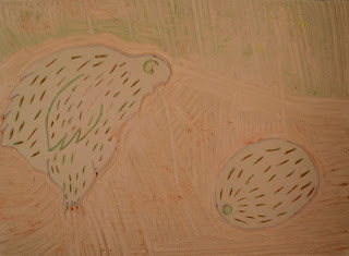
this past unit we worked on print making. this was my most successful print. because it had the most bold colours, and less empty white spaces.
     the part i found hardest about this assingment was getting the ink on the print just right if it was too dry it wouldn't transfer properly and if it is too wet the lines would bleed out.
     I think something I that I did well was the carving. I was surprised at myself that i didn't mess it up. i think that it was a pretty reateive design having a kiwi bird staring at a kiwi fruit curiously. there was originally a question mar over the top of the kiwi fruit, but I had t cut it out because it was backwards on the print.
if i could change one thone thing about this assignment it would be that i would have made sure that the question mar was the right way, because it made the composition much better

Wednesday, March 2, 2011

Chinese brush painting


The first unit we did in the traditional arts part of CyberARTS was Chinese brush painting. It was very different from what I am used to because there are very many strict rules and procedures to the painting style. First the way you hold the brush is different, to properly hold the brush you have to make a peace sign then hold your thumb behind, and you have to hold the brush up vertical. And when doing lines you have one chance, because if you mess up it is against the “rules” to touch it up and fix it. And when making flowers there is a certain way you have to draw them, and a certain order you have to draw the pedals in. Since the rice paper is so absorbent it is really hard to get the amount of water so it doesn’t bleed or make your brush strokes rough.

            This is my best painting. It is of a branch of a cherry blossom. The flowers are really hard to do because they are so small and fine,

Wednesday, February 9, 2011

This is a flash project that i worked on for the last 2 days it was my first time using adobe flash cs4. my idea came from the very first video-game "Pong", it is just a simple loop animation of the ball bouncing back and forth. We are learnig about easing and motion, shape, and classic tweens. So far from what we have done flash has been pretty simple and straight forward, and I'm looking forward to doing more complicated and interesting animations.

I'm Back


After a whole year of waiting I have finally started back up at Cyber ARTS. To start of the semester we are doing traditional Chinese painting with Mrs. Mcfadyen, and we are learning how to use flash with Mr. Koczij. It great to be back in my favorite class, and I hope that this semester I will learn a lot.