We went to the national film board and learned about stop motion animation
click here to see the video
Friday, December 18, 2009
Wednesday, December 16, 2009

Friday, December 11, 2009
fun with perspecetive
I drew this perspective picture in my free time at the beginning of the school year. Last night I was bored so I took a picture of it, and brought it into paint then I fooled around with it a bit.


Monday, December 7, 2009
stop motion animation
These are stop motion animation I thought were really cool because they are both made with sticky notes. Dead line has sticky notes on a wall that creat a picture but yellow sticky notes has the pictures drawn on them.
deadline
yellow sticky notes
deadline
yellow sticky notes
Friday, December 4, 2009
Surreallism
What is surrealism?
Surrealism is putting a bunch of different pictures together and making them look like one picture. that has something strange or impossible happening in it.
3 examples of Surrealist art (listing the artist’s name)

This artist is Frank Picini

This one is done by George Grie

This one is also by George Grie
Surrealism is putting a bunch of different pictures together and making them look like one picture. that has something strange or impossible happening in it.
3 examples of Surrealist art (listing the artist’s name)
This artist is Frank Picini
This one is done by George Grie
This one is also by George Grie
Wednesday, November 25, 2009
We were asked to look for an anti racism PSA*
At the beginning it there is calm music and it show peoples shadows asking why people are racist to them. Then it shows someone covering up graffiti that says racism. Then it goes to people saying that they believe that they can stop racism.
The main focus of the video is the impact of prejudice discrimination
To see the video click here
Tuesday, November 24, 2009
video sequincing article
We were asked to read an article on video sequencing
I learned that with video sequencing you have to learn and practice it you can’t just do it there is lots of planning and strategy involved. Video sequencing is used to shorten and simplify a video clip, which keeps your attention so it does not bore your viewers. An example would be instead of having someone walking down the stairs to their kitchen making bacon then eating it (which would take about 2 minutes) you could film 2 seconds of the person’s feet going down the stairs. Then a quick shot of him entering the kitchen, a shoot of bacon sizzling in a pan, and finally him putting a piece of bacon in his mouth, and chewing. Sequencing makes a video easier to watch, and more interesting, but it’s something that takes lots of training and practice
to see the article click on the link
Wednesday, November 11, 2009
e are going to start making our own optical toys we are goin to be making thaumatropes which is a circle with a different pictre on each side and when it spins the pictures go together, and phenakistoscopes is a wheel with different pictures on it and when it spinn it looks like the picture is moving
here are some example.


here are some example.

haumatropes phenakistoscopes
Monday, November 9, 2009
Friday, October 23, 2009

Tuesday, October 13, 2009
logo assignment


My company is Fisheye Productions. We design logos, posters, bulletin ads, graphic Designing, you name it we do it all. We do all styles all you have to do is give us the title and Description of your company or product, and some possible ideas that you would like. We can do designs for anything from a baby product to a food product.
The fish eye symbolizes the ability to see 180 degrees. Here at Fisheye Productions we understand everything that we need to know about you and your product or company. The fish is a very quick and beautiful creature, which another reason why I picked a fish, because I get things done quickly and they are still very creative and neat.
In my logo I made the eye bigger than it normally would be to make them stand out more, because it is the main part of my name. My logo works is all different colours and sizes. The wide range of colours gives all kinds of feelings. The logo consists of smooth and rough lines. The one I like the most is the orange one because it has a warm feeling.


Saturday, September 26, 2009
Porcelain Installations
This week we are going to be making porcelain installations for display cases in our high school hallways. Porcelain is a very smooth soft clay that is great to work with.


 Here are a few sculptures I'm using for inspiration...
Friday, September 18, 2009
repetition and rhythm assignment
repetition

The rhythm I used in this picture is with a wavy line. The spaces in-between the lines are not all the same which makes it a bit more interesting. The lines give me a calm flowing feeling from the wavy lines. Originally, there were fewer lines and wider spaces in between,. It wasn't that interesting . There was too much white and not enough shape. I added more lines which decreased the amount of space or whiteness in the graphic.
rhythm
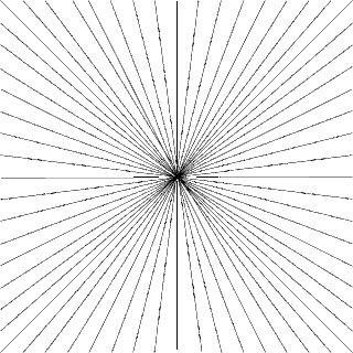
In this picture, all of the lines are going into the centre of the page. This creates the illusion of lines going into the distance. I didn't want to add different sized lines to the drawing because I thought it might decrease the symmetry and make it look sloppy. I like the neatness of the lines.
Miro, "Dutch Interior II,"

Imitationalism
This drawing is a complete failure when it comes to imitationalism. In the picture there is what seems to be a bunch of crazy looking animals that look nothing like how they should in real life. There is no shading and everything is flat, warped, and unrealistic. Some of the colors are somewhat normal, but some of them are clearly way off there normal color.
Emotion
The emotion in this picture is very exciting and energetic. At the same time it's a bit creepy. because the animal shapes are distorted. The colours aren't very vibrant but the way they are used makes the painting more exciting. The tones are rich and mostly warm. The way the lines curve and join together and the way the animals are streched and warped gives me the feeling of calm. At the same time it is stressful to look at because the eye can't understand what it is looking at.
Formalism
All the lines are crisp. There are different textures that help create a mood. The rough texture of some of the painting makes the painting look unfinished. The picture is totally two dimensional creating the effect of flatness. There is no shading and the colours are basically solid. The negative space is around and between all the animals and the positive space is the animals. Because there is so little shading there is also very little detail.
Subscribe to:
Posts (Atom)