This week we are going to be making porcelain installations for display cases in our high school hallways. Porcelain is a very smooth soft clay that is great to work with.
Saturday, September 26, 2009
Friday, September 18, 2009
repetition and rhythm assignment
repetition
The rhythm I used in this picture is with a wavy line. The spaces in-between the lines are not all the same which makes it a bit more interesting. The lines give me a calm flowing feeling from the wavy lines. Originally, there were fewer lines and wider spaces in between,. It wasn't that interesting . There was too much white and not enough shape. I added more lines which decreased the amount of space or whiteness in the graphic.
rhythm

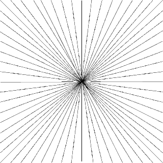
In this picture, all of the lines are going into the centre of the page. This creates the illusion of lines going into the distance. I didn't want to add different sized lines to the drawing because I thought it might decrease the symmetry and make it look sloppy. I like the neatness of the lines.
Miro, "Dutch Interior II,"
Imitationalism
This drawing is a complete failure when it comes to imitationalism. In the picture there is what seems to be a bunch of crazy looking animals that look nothing like how they should in real life. There is no shading and everything is flat, warped, and unrealistic. Some of the colors are somewhat normal, but some of them are clearly way off there normal color.
Emotion
The emotion in this picture is very exciting and energetic. At the same time it's a bit creepy. because the animal shapes are distorted. The colours aren't very vibrant but the way they are used makes the painting more exciting. The tones are rich and mostly warm. The way the lines curve and join together and the way the animals are streched and warped gives me the feeling of calm. At the same time it is stressful to look at because the eye can't understand what it is looking at.
Formalism
All the lines are crisp. There are different textures that help create a mood. The rough texture of some of the painting makes the painting look unfinished. The picture is totally two dimensional creating the effect of flatness. There is no shading and the colours are basically solid. The negative space is around and between all the animals and the positive space is the animals. Because there is so little shading there is also very little detail.
Subscribe to:
Comments (Atom)


