repetition and rhythm assignment
repetition
The rhythm I used in this picture is with a wavy line. The spaces in-between the lines are not all the same which makes it a bit more interesting. The lines give me a calm flowing feeling from the wavy lines. Originally, there were fewer lines and wider spaces in between,. It wasn't that interesting . There was too much white and not enough shape. I added more lines which decreased the amount of space or whiteness in the graphic.
rhythm

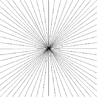
In this picture, all of the lines are going into the centre of the page. This creates the illusion of lines going into the distance. I didn't want to add different sized lines to the drawing because I thought it might decrease the symmetry and make it look sloppy. I like the neatness of the lines.

No comments:
Post a Comment